Kristi Colvin

Designed for threat analysts.
Developed using React & Keylines.
As Lead UX Designer at King & Union for 18 months, my role was to transform the legacy app into one that would onboard analysts more quickly and make Avalon more competitive. Both goals were achieved.
Getting to Know Avalon
As Lead UX Designer for a team of engineers who had been designing their own app, I needed to do three key things:
1Discovery & Strategy
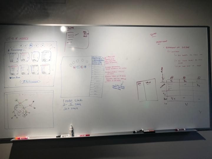
Working with business and engineering an initial goal was to rapidly generate some new concepts to generate discussion with my new team of devs. We did this using whiteboarding sessions which helped us get to know each other while they explained tech limitations and needs to me. Dealing with a backlog of user and sales requests plus technical changes we knew we had to make, it was clear some significant changes were needed.
2Align the Brands
The brand for King & Union and the brand for Avalon suffered from a disconnection. The product logo had nothing to do with the corporate logo and there wasn't a cohesive story to tell. Working with the marketing director one of the first things I did was to align the brands without significantly changing them, but upgrading the typography and logos and standardizing branding we could use for for product and marketing assets.
3Create a Process
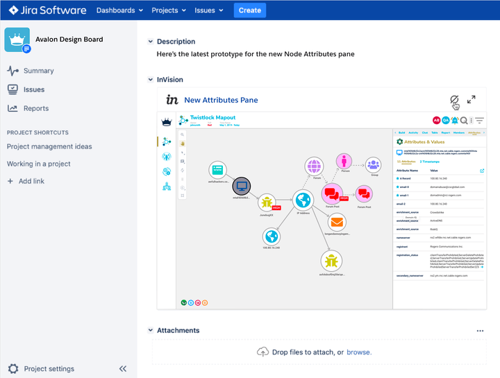
The development team got a new manager shortly after I was hired and together we defined design processes and he got the devs working in Agile sprints. We used Jira to manage tickets and set up a Design board for our product design team to work in separate from the Development board and then moved tickets over from final designs. I worked with them before and during the coding and did acceptance of the UI changes before design was pushed into production.
Iterative Design Process
This was the usual flow of work between myself, developers and our threat analyst users.

1 Whiteboarding Sessions
At King & Union we often began with whiteboarding brainstorms because we had a lot of technical and design alterations we needed to make decisions about before I began designing.
Brainstorming with a new development team was crucial to earn trust and allow them to feel heard since they previously had full ownership of the design.
To avoid confusing existing users, I worked from a similar framework the legacy design used - navigation on the left and in the header, etc. but with usability improvements. This not only helped users but developers as they didn't feel I was ripping apart all their hard work.
Collaborative whiteboarding is a great, easy tool for bringing teams together around design ideas so that everyone feels shared ownership, even though I am driving the design in a new direction.

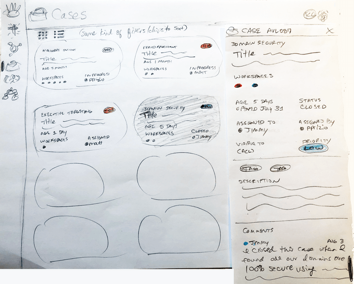
2 Pencil Sketches
I often did pencil sketches quickly that I could show to my boss and then went straight into Sketch. He and I were a product design team of two and if we were on the same page regarding these design plans, I was ready to work on the prototype.
Pencil sketches are good to do when the people you show them to can easily visualize what you're doing... I like them for internal use but not as much for user feedback unless they are a design partner very familiar with the product already.
It's fast and easy to do multiple variations using pencil. It's like thinking out loud for me and feels easier to play with out of the box ideas and realize gaps and issues you might have.
I often make notepads of the basic shell design to start from so I don't have to redraw stationary elements all the time.

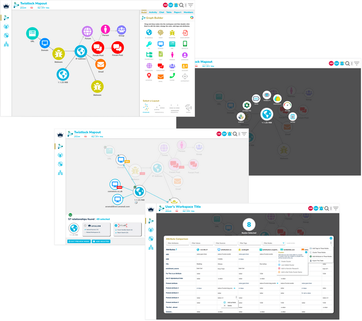
3 Sketch Design
I created reusable components as I went in Sketch which made designing new screens and features faster.
I do Material-based design, with some variations that make the brand unique.
Both a light and dark mode was planned and prototyped in my first concepts, but we wound up focusing on the light mode first and I had dark mode concepts waiting to be developed but did not get there while I was employed.
We rushed to get a fairly complex redesign done to launch at at a large industry conference, so style guides and standardization came after this push when I had enough UI components defined that we were comfortable using as standards.

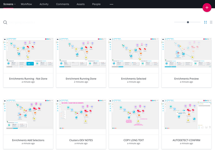
4 inVision Prototypes
Everything I designed was turned into a working prototype for the developers. I did a few flow diagrams at times but they usually weren't needed for the UI work. These prototypes, our design reviews and my constant availability worked for this small team. They often did technical flows for backend partner integration.
As we grew to have our own threat analysts as employees for me to work with, I included them in a design acceptance checkpoint and I used these prototypes to show them the flow of new or altered features and get feedback for iterations if needed.
Our Partner VP and CEO also used these prototypes for partner and investor discussions to show the future direction of the platform because it was rapidly changing.

5 Developer Handoff
We worked in 3-week Agile sprints and managed tickets using Jira. inVision was integrated into Jira tickets and a Slack channel. I kept my user notes from analyst sessions in a Confluence space. My design work was ideally done a sprint or two ahead so we had time to cycle through feedback and iterations.
We had a design board separate from the development board to move tickets through Ideas/Research, Prototypes, Design Reviews and Final Design lanes. Often our design tickets would be full of discarded ideas, questions etc. so we cleaned tickets up in Final Design and copied them over to the Dev board for the team to work on.
I did design acceptance when the dev was ready for that and work was in our dev environment. Once accepted it was scheduled to move into production.
"This UI should be
industry standard!"Apple™ threat analyst during an onboarding call
Design Thinking
Some of my thinking behind this redesign.

Avalon Before Kristi
A decent framework to start from
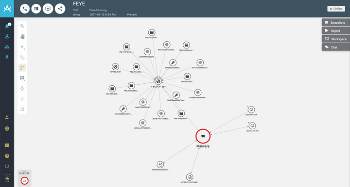
When users created a workspace the screen was just blank - they had to know to use the toolbar to add the first node to the graph or a little strangely, they could open the chat dialog and type an ip address in and then add it that way - something a new user would never know to do. There were many navigation issues I also wanted to make better, but I kept the same essential framework as you can see in the After version.

Avalon After Kristi
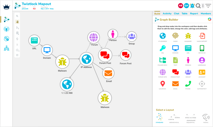
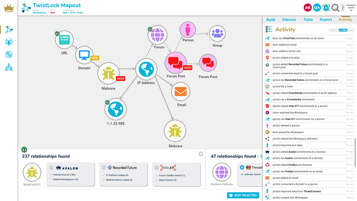
A new graph builder, less screen clutter & easier navigation
One of the biggest issues the original product had was the lack of any clue about how to get started. Keylines, which is the graphing software, had a drag and drop feature, so I wanted this to be the first thing users experience. I also moved some old and new features into an easy to show or hide dock pane. This pane is used in a flexible way to reveal attributes as users hop from node-to-node, or for working on a case, chatting or writing a report..

The Arc
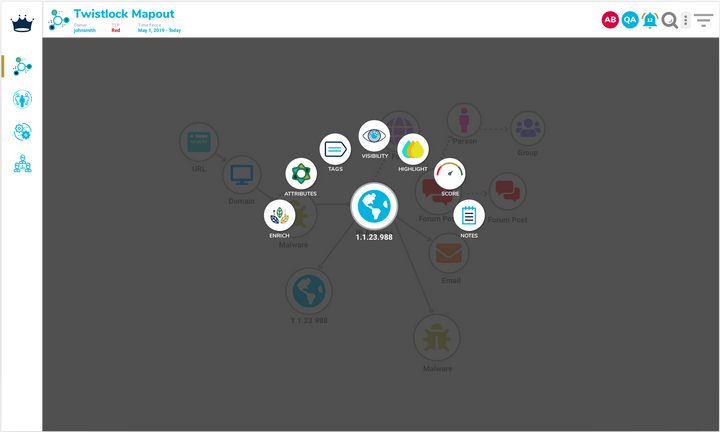
Options for a single node, multiple nodes or cluster of nodes
One of the goals we had for the product redesign was to make Avalon accessible to less experienced analysts, while retaining advanced functionality for experienced threat analysts. We wanted the app to feel a little like a game and mobile app, and were pleased when people saw it at the RSA conference and commented that it looked like a game and they were curious. Our partners also seemed to admire the new design.

Arc Dialogs
Keeping users focused on a single quick task
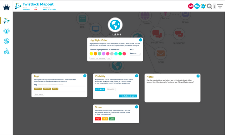
Click a node on the graph and you get the arc. The arc breaks down tasks and displays mini dialogs (several shown here) so users can do things quickly. This helps people as a guide to add/view data that exists about an indicator. They can also perform bulk actions on a group of indicators by selecting multiple nodes and then launching the arc. The node changes in real-time to show a highlight color or score (things that change visually.)

Elevating Data Partners in the App
Highlighting one of the primary reasons to use Avalon
Partners used to be found in a single dropdown in the license area, or in a dialog for enriching a node, just in plain text, no logos or anything to give visual cues about the data you want to see. I wanted to change that and we began adding partner logos to make them more visible in redesigned areas. I designed the enrichment carousel for selecting specific enrichments, and designed an activity pane inspired by Facebook's as a solution to a problem.

Attribute Comparison
Helping users find and filter data to take action or export it
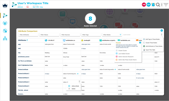
Graphs can get out of control - what you see here are my very basic design mockups but a graph can have thousands of nodes and users need to cluster them, research them (enrich them even more which may add more nodes), export them, add tags or attributes. They also need to compare attributes and all of the above is what this table design offered. You only see this table if you have multiple nodes or a cluster of nodes selected.
Watch the Demo
Not everything you see here was able to be redesigned in time for launch, but most of this shows the new design.
More than one partner told us at RSAC:
"I'm jealous of this UI!"
RSA Conference Experience
I also helped craft a brand experience for the launch of our new product. We took over a section of the W Hotel and used this artwork for large signage, social promotion, email invitations and even t-shirts. These are just a few of the scenes I created.
Redesign Results
Compliments from partners and prospects, new users gained, and former users came back.

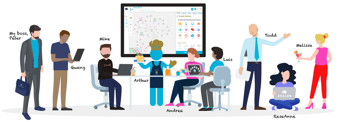
I did some of my best work with this incredible team – these are a few of my friends.
I had some goals, aside from just increasing the usability of the app, when I was hired to work on Avalon the first was to get users on the platform – they had been struggling with that despite having a phenomenal, sharp sales team. Avalon needed some technical changes made and it was not as appealing at a a glance as it could have been. Post-launch at RSAC with this new design we began to see results when multiple intelligence teams from major Fortune 1000 companies wanted to see if they could replace our competitor, an industry standard, with Avalon. We closed multiple POC deals.
Unseating that key competitor was also my personal goal. That application has some graphing advantages but does not offer the same ability to collaborate with others that we did, but they are older and entrenched in the space. So to hear over and over that a brand wanted to see if they could make the switch to Avalon was personally satisfying – if you can't unseat another app so widely used it is hard to gain traction.
Partners really liked the new design and we had elevated them on our website with new product integration pages, in campaigns and also in the app so the difference was tangible. This was important for new partnership deals as well as crafting co-branded opportunities with our biggest partners.
Review the Avalon Marketplace to see how we turned traditional partnerships into an industry disruptor.


