Kristi Colvin

Designed for contact center agents.
Developed on Salesforce.
I worked on so many things at Home Depot in just 9 short months on contract for the Contact Center agents, whose primary experience was using Salesforce Service Classic.
My Projects & Activities
My UX team activities were interspersed with user research and design for my Contact Center agents who worked primarily in Salesforce. I only have a few examples from my time there to show, but this is what I did while there:
Established UX Standards
My product team was large and comprised of two teams, the main one working on Salesforce development in Classic (Lightning Service Cloud was not yet live, but we had it in a sandbox.) These teams had never had a dedicated UX designer so part of my job was to bring standards established by our UX team into the designs I did for this group.
User Research & Lots of Observation
I had the best experience of my career so far in one aspect here: I had access to hundreds of all my contact center users, who were in three buildings in Atlanta, and I could go see them with just a phone call. I was constantly in and out of the centers and everything I worked on was directly inspired by something I saw or a direct answer to a need.
Launched a New Fraud App
Another UX designer had been borrowed to work on a new Fraud app and it was not quite done when I was put onto the Contact Center team. I finished it, got it launched with developers and then did a lot of user observation to learn how we were still not solving their problems because they had to do double work in two apps. Long story, but I fought for them as much as I could, even providing a report with cost and efficiency analysis, but it was not a management priority.
UX Team Activities
Home Depot has developed their own facilitation process called the Orange Method and I was among the first people to go through this with our team. We also did a lot of design studios - I ran some and participated in some, and every Friday the UX team we had Design Crits and looked at one or two people's work. I also sat in on other team's user testing and helped do synthesis afterward, which was interesting as I saw a variety of other apps and areas of the company UX designers were working on.
Custom Salesforce Features & Prototypes
You will see in my samples a bit of a mashup of my Material design within Classic as we were making our way toward the Lightning platform, plus some pure Material design prototypes. Our agents had to have a lot of training to use Classic and HD UX team has a goal of zero training, something incompatible with Salesforce. I made improvements, but could not do the full redesign I wanted to and that users needed while there.
Green Screen to Web App
To order parts, certain agents had to use green screens to get into warehouses and locate and find these parts. These agents were super fast from doing it so long, and when they wanted me to redesign this process to be a web app my biggest concern was it would slow them down. However, the server was being shut down so we had no choice, plus new agents could now do the parts ordering, whereas before it was too difficult to train them.
Online Spreadsheet App for Bulk Communications
Every summer a dozen employees spend a ton of time just communicating about product delays of patio furniture, weirdly enough. This starts in the Spring when they have sales even bigger than Black Friday sales as the whole world is ready to make their outdoor living spaces better. It had been done manually using spreadsheets and these poor users just need to be able to have some help from an app while still uploading the spreadsheets with order info. I came up with a solution they loved that allowed them to upload the spreadsheets, keep it in that tabular format, but then take action to send appropriate messages to people with their estimated ship dates.
Served on the Salesforce UX Team
The UX team, and especially my Contact Center product team, was in a conundrum the entire time I was there. Lightning was barely out for the Sales cloud and not available yet for Service, and Salesforce, the company, did not have the branding flexibility we wanted to see. Our UX team of 100 people was on a mission to standardize employee apps and yet we had this Salesforce issue of it being their design and so limiting. We had a team of people trying to get to some decision about what to do, and constant discussions and even a full-day workshop with Salesforce UX & Lightning devs... and still had not made a firm decision when I left.

Kicking Off: Establishing the UXFCC
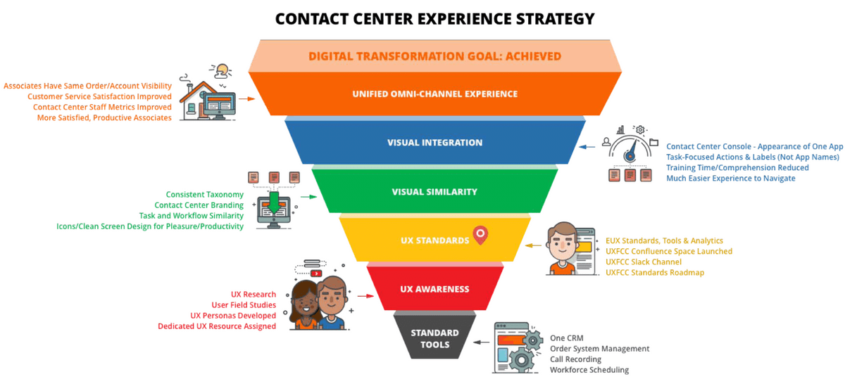
UX for Contact Center Strategy
I was lucky to be armed with some excellent personas and app research another UX person had done, that I studied prior to my
first field studies and helped inform this phased strategy approach, which I presented at an all-hands breakfast meeting. I coordinated this with the Director over our teams and he talked about how they had made some great strides toward technical standardization of tools, and then I talked about how we were in the second tier of beginning to work in UX processes, and then our Design System team spoke on that third tier about all the tools we had for developers and how they could call on them for technical help and me for design help. It was a great way to help them visualize a vision, even if specifics would change later.
Problem: Profiles Hard to Scan Quickly
Contact Center phone and chat agents are under some pressure the email agents were not, to pull up the right customer on the line with a problem, find their order or see any recent notes, all while soothing that person, sounding efficient and not being able to take any notes with a pen or pencil. Salesforce Classic did not make this easy, and Lightning Service Cloud not out yet in 2016.

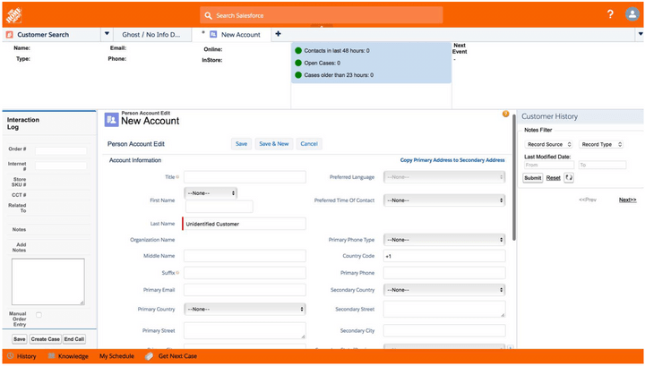
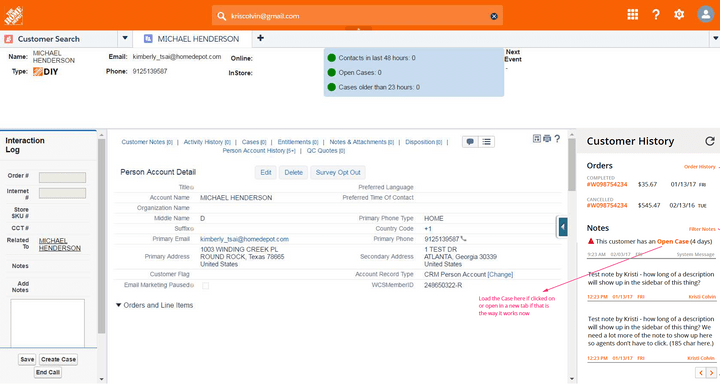
Customer Profile Before Kristi
This is what the Interaction Pane, History Pane and Account Header looked like before I got there.

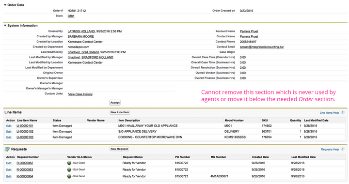
How an Order Looked in Salesforce
A customer’s account is full of long screens of tiny info, and we could not remove many of the sections or change this UI.

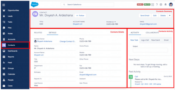
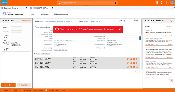
How it Might Look in Lightning
The new header is modeled from a future state Lightning version of the console, so when we switch this should look familiar. This is
also similar to styling we use in other apps.

My First Prototype to Aid Scanning
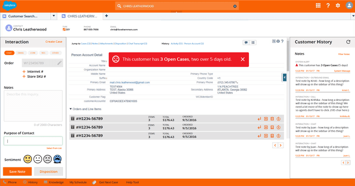
This header has been slimmed down considerably and any important alerts added to a new History pane as well as via a Toast popup. Orders now expand/contract for list items.

History Pane Gets Added to Classic
The team and users liked the History pane so we isolated it and got this into Salesforce first. Users now had more info than they before about recent history when the customer's profile was found.

First UX Changes Go Live!
We implemented the center order pane changes, history pane, toast and altered header but did not change the interaction log to my new one. See below for my design thinking on ending a call.
Problem: Ending Contacts is Irritating
This is an example of how I think through a design problem to come up with a better way of doing something.

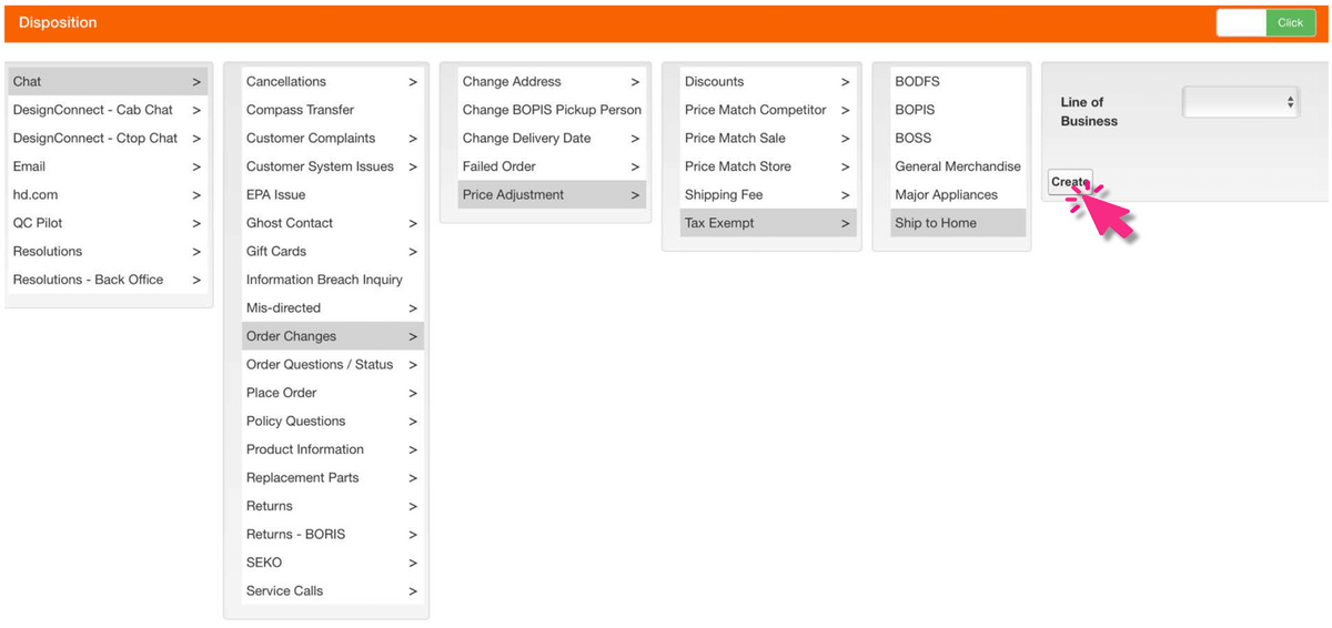
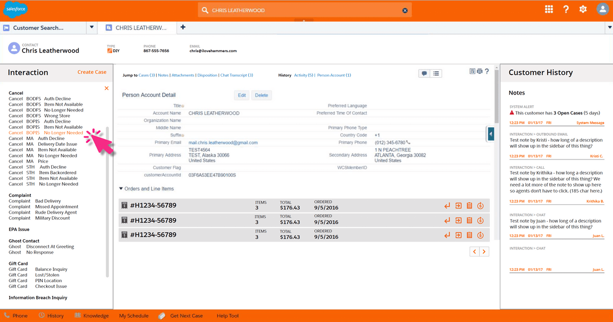
The old way: a giant multi-level menu that agents hated
This is a typical example of the depth of the disposition menu in 2016-17, which agents had to use to end a chat, call or email inquiry.
They didn't like it, and devs could have coded some auto-detection and rearranged this menu to eliminate what wasn't needed based on some known data, but it was not done that way.

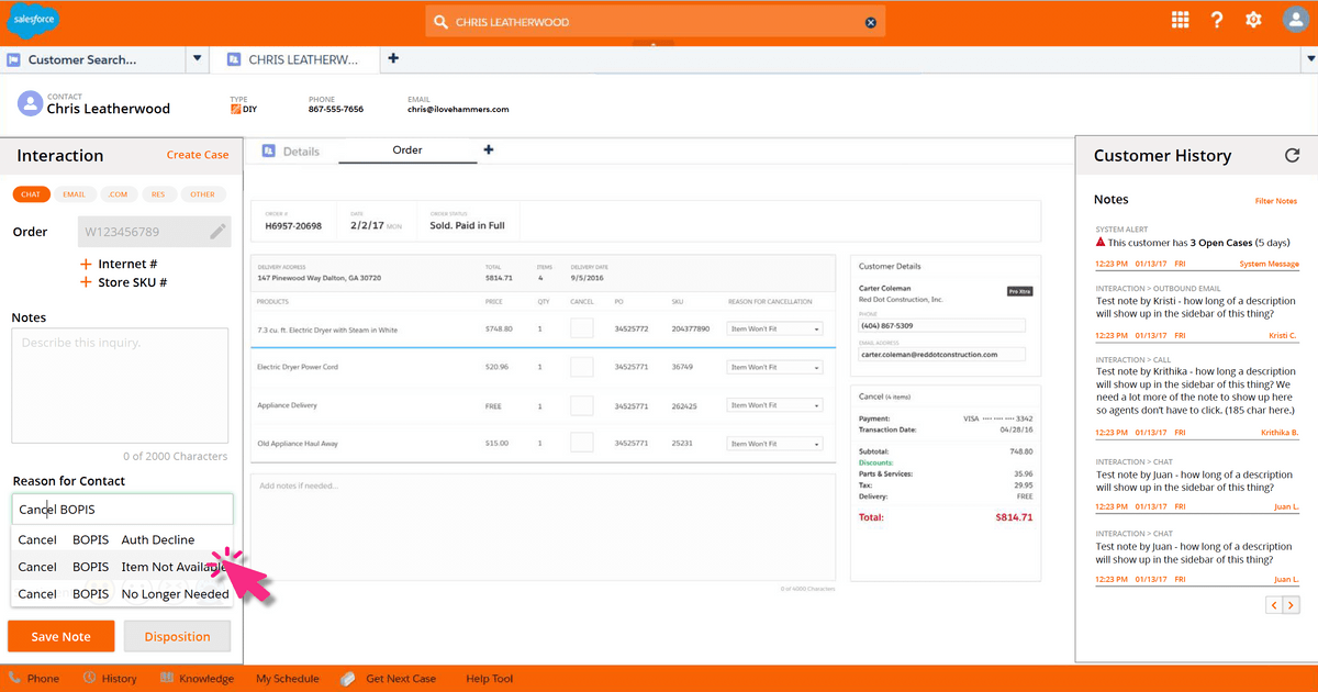
A new way: use natural language & type-ahead
If we reworked these labels using natural language, ending these contacts (called dispositioning) could occur faster by typing and auto-suggestion.
This can be controlled with code so agents have to select one, though I had changed the flow so it was a task they could do while talking to the customer instead of being forced to wait till the end before picking the right reason for the call.

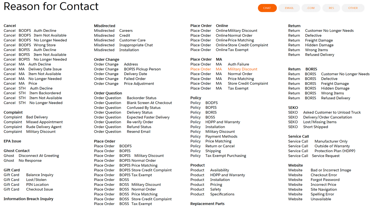
Alternate method to find the right label: Select from List
If the agent did not know the right words to use, they could also Select from a List to see all disposition labels, and this list appears in the same pane and goes away when they select the right one.

Natural language was needed instead of cryptic corporate terms
The dropdown menu labels need some word changes to make them more natural language and logical as auto-suggestions. The idea here is only a small set of fairly easy to recall words would have to be memorized, such as Cancel, Order, Gift Card, etc and then those options would appear.
The agent would also select a chip or it might be auto-detected to label this type of inquiry: a call, chat, email, etc.
This is how I chose to make this task faster and the agents liked the new design.
Reimagining the Account Profiles
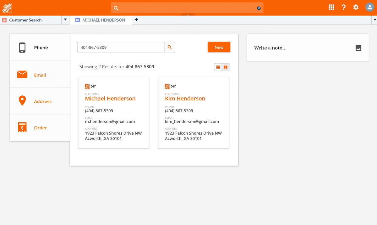
Sometimes you have to toss out all the limitations and create what you think the user needs, for discussion and feedback. This is my favorite thing that I designed while at Home Depot. I did some minor variations and this gave our team a lot to talk about.

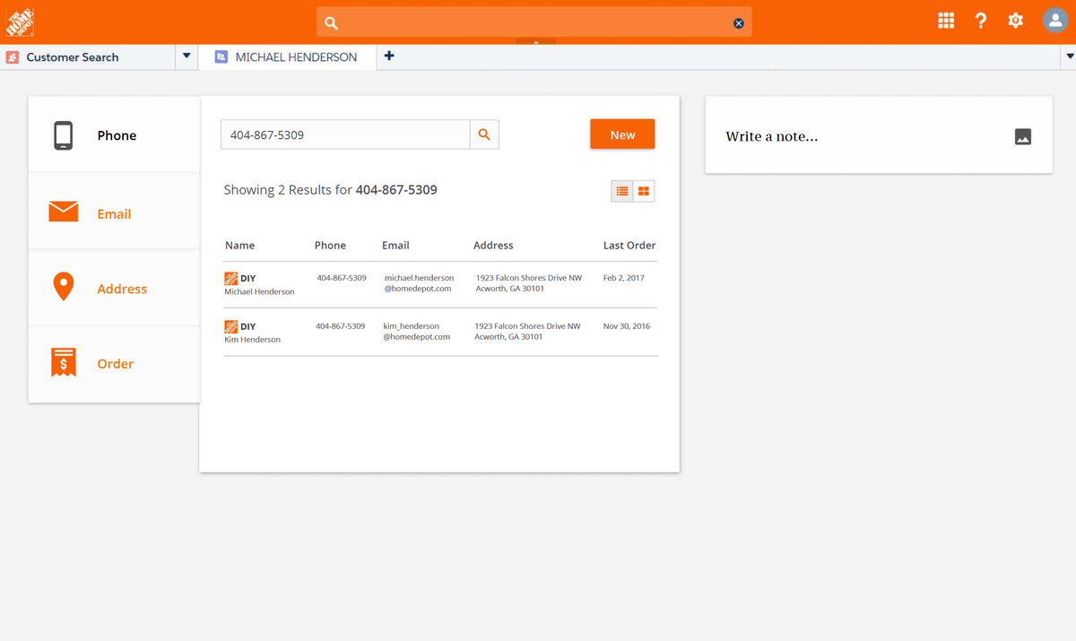
Lookup by phone brings up two results in card view because this is a married couple with same phone and address.

List view of the same results, which I designed as an alternative because the agents were used to the columns in Classic. Giving them this option was important – people get used to where things are without having to think and I did not want to slow them down with the new card view though some (myself included) found those easier to process visually.

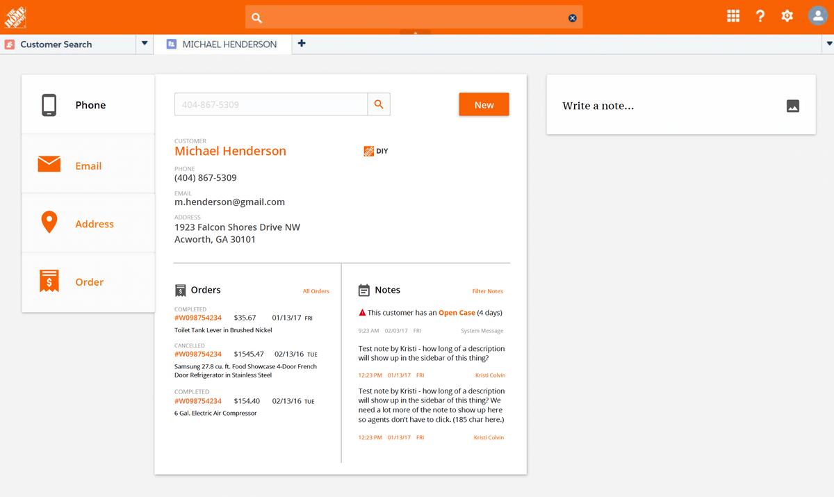
New account profile, designed for fast scanning of recent orders and agent notes.

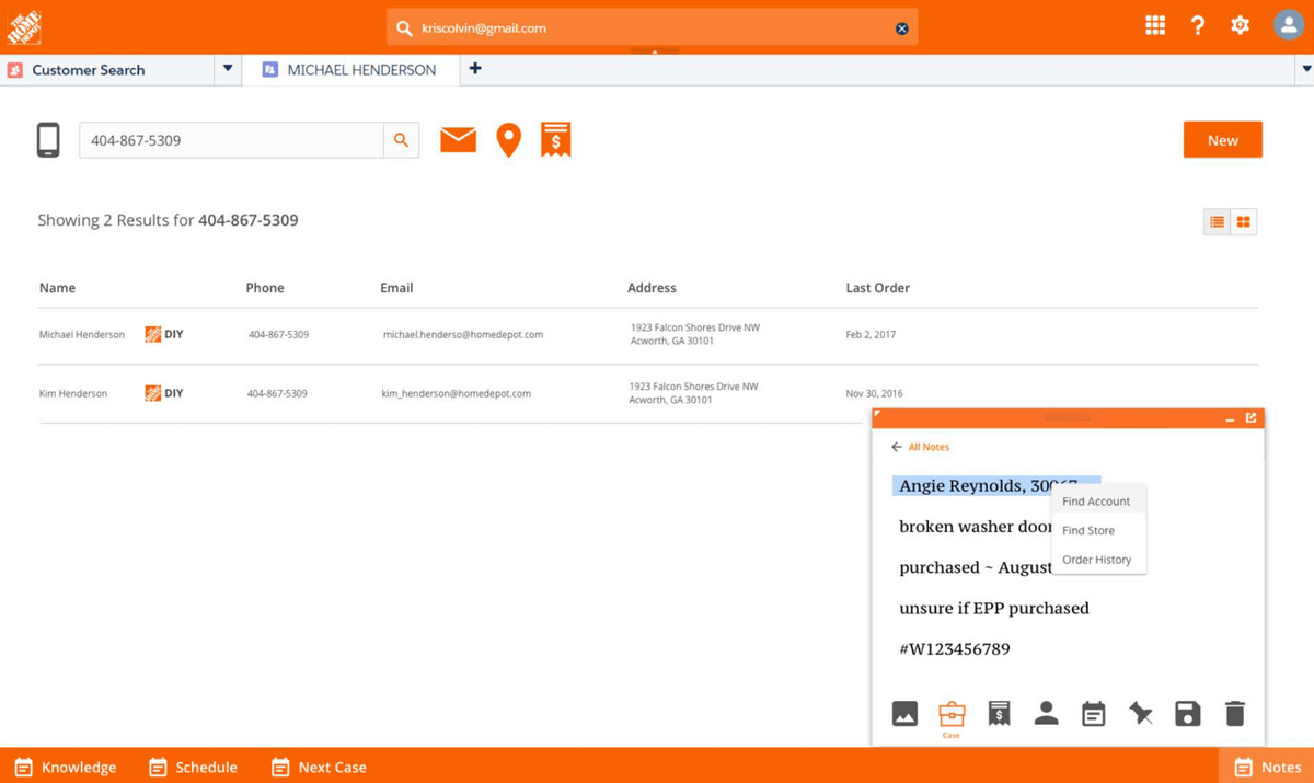
A variation of results header and notes. This is a design for something I called Smartnotes, inspired by the simple elegance of Google Keep. Our agents wrote a lot of notes and had to workaround not having anything in Salesforce they could use as a scratchpad. In this concept I wanted them to be able to type their notes but then take actions on them with just some clicks, like find an account with the customer name, or pull up the order, or attach an image or link from the website as reference.
This is as far as the concepts went. We still couldn't decide if we would do our own design or force the use of Lightning.
Problem: Need to Process Refunds at Delivery
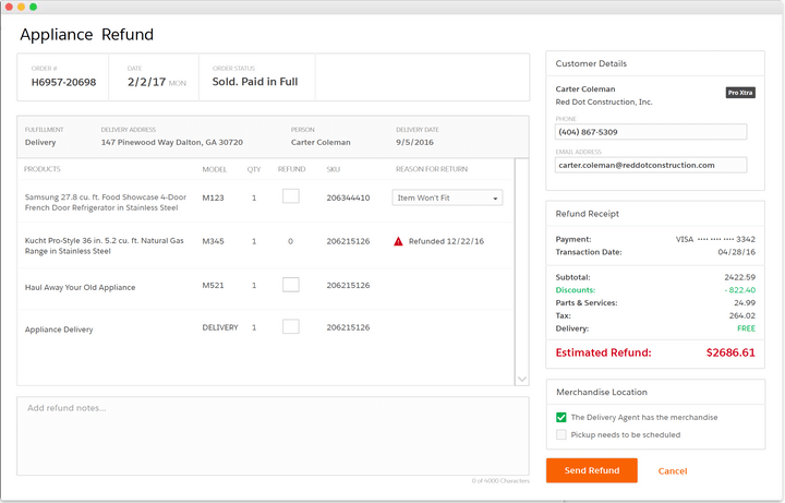
Custom designed order screen, iframed in Salesforce Classic, with companion mobile app

Refund Screen for Contact Center Agents
First Problem: How do we do this in Salesforce?
This screen looks so simple, and in fact I didn't do the original design – it is modified, but modeled on a design for ordering meant to be used over the entire company called Order Up. That was a large effort being rolled out in phases, but I wanted to use the coming design for consistency and checked with that team to make sure it didn't interfere with their work.
In reality this was one of the most controversial things we did, because one of the managers did not want Salesforce used for this financial purpose. And I got it – a whole new level of architecture and security had to be considered since we would. be processing money. We decided to give the appearance of integration via an iframe with form housed elsewhere.

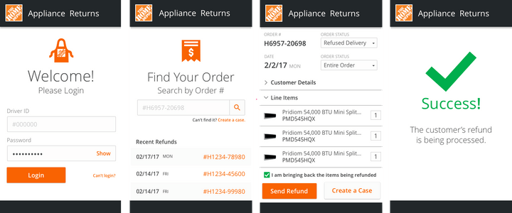
Mobile App for Delivery Drivers
Second Problem: Delivery drivers doing transactions was not HD process.
Home Depot had parameters around training people who handled refunds and delivery drivers were not part of the Contact Center. We wound up creating a good solution: drivers would only initiate the transfer and then it would go through our normal process as the submission from their mobile app would kick off a ticket in Salesforce that would get in the queue and an agent would pick it from there. The driver could indicate if the customer still had the appliance or not.
The customer experience would be that if they had refused the appliance or there was a problem, it would be taken care of at the door from their perspective. I liked working on this challenging project with the team as I really seem to like pushing these platforms to the limit.
Executive Dashboard Prototypes
Imagine you have a customer who has bought a house and paid for $75,000 in home remodeling projects, and then they want to do a $10,000 fencing project and something goes terribly wrong. Maybe the lumber has those awful bugs that turn things to dust. They are upset, and want a refund of thousands of dollars or the fence project redone. The manager who gets this issue sent to them doesn't have time to fully look at every note and order from the past to see the big picture, so how could we provide a fast snapshot prior to them getting on the phone?
I designed these dashboards to provide an overview of the customer spend (individual or company) and some things we know about them based on data we had in the Salesforce database, in some cases combined with api data from available resources. I have experience mashing up a lot of social media api's into one page, which is partly where this idea came from of using Manta or Zillow api's to give us info based on the address we had. This was one of the last things I did for Home Depot so not sure where they went with the idea from here. Scroll through the ideas below.


In Conclusion
Home Depot was an experience I really wanted to have, as I had never been part of a large UX team or worked for retailer this large (doing app design at least – my first job was for JC Penney doing visual merchandising.) I learned a lot!
The Best Thing at Home Depot Was...
I had unlimited access to my users, hundreds of Contact Center agents, including the Fraud team, all the managers and supervisors, and multiple types of groups that had been acquired and put onto one team. Three buildings full of my users to observe, work with and talk to made my design as custom-fit as a designer can offer. I've never had such free access to my users and may never again in my career.
I enjoyed adding Salesforce to the list of platforms I have designed on top of. With talented front-end devs you can figure out a lot of neat tricks that make a user's life easier and we did.
I liked doing UX activities with the larger UX team, like our design studios, trainings in the Orange Method and the design critiques which were a lot of fun. Being at HQ in Atlanta in general was fun... the campus was nice and we had an enormous Starbucks I sometimes worked in.
The Biggest Challenge Was...
I wanted to know what sorts of issues existed working in a company this large. The biggest challenge was apps not getting launched. Salesforce is used all over the company, so the indecision about using Lightning or not prevented speed in redesigning a console for the agents, plus there were so many people involved I could not even convince them to just let me show them a prototype of a new console I had a vision for in my head. The agents used up to 133 different applications, many of them not ours, but a manufacturer's app for example. I wanted to do what I do best and design a console and info architecture to access all needed, based on role, but couldn't.
In the meantime I worked on a lot of interesting apps, like the green screen replacement and the prototypes I did, but with a long history of not just being a UX designer or manager, but having lots of clients, I am used to launching things. There is definitely a beginning-to-end process I am more used to than I experienced here.

