Kristi Colvin

Designed for supply chain buyers & sellers.
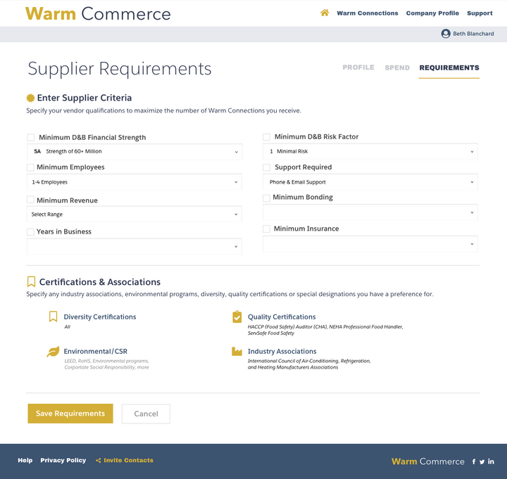
Developed on Salesforce.
I did the branding and design from start to finish for this MVP of a B2B, two-Sided SaaS marketplace on Salesforce.
What I Did for Warm Commerce
This is how one dev and I got this MVP done in 12 weeks so they could validate the concept with prospective users.
1User Flows/Strategy
From requirements intake, with a short schedule I did a few screens to show design for approval, and then did all the user flows.
2MVP Product Design
I did the design from scratch using Sketch-to-Avocode for the dev to get files, CSS, images, etc. from that platform.
3Brand Assets
I created the simple brand, style guide, business cards, datasheet, tradeshow assets, website and social profile images for them.
12 Weeks to MVP
Step-by-step flow of the path to product launch.

This product was planned but not designed.
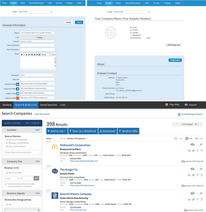
Armed with feature detail in an Excel spreadsheet, a pretty good requirements document that had user types in it and example screens from other products, the developer and I dove into the design headfirst as we had a short timeframe to get this product working.
I did not have users I could talk to, but I did a depth interview with an oil company owner I know who constantly interacts with suppliers. He did like the concept a lot, but was not the exact user Warm Commerce would initially target, as that would be more of a procurement type user at a desk. He had a lot of ideas for a supplier-focused mobile app that I wrote up in detail and gave to the team for future consideration.

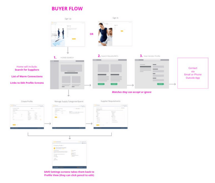
User flows bridged the gap between the developer's knowledge and my design.
The developer had been hired before I was, and was working on database and Salesforce-related things so he was laying the foundation even before my design. That doesn't mean he could anticipate all the interaction and navigation in my design though. I did many user flows, for every aspect of the product, which helped not just the developer but the founder and salespeople understand how to show, talk about and understand the product.
I did not just use these pre-design. During design, and this is something I often do, I replace the wireframe screen with the finished screen design as you see here. This helps myself and stakeholders see at a glance what is not yet finished. It's a helpful tool when you are really in a crunch to get a product out fast, and the designer and dev are working simultaneously.

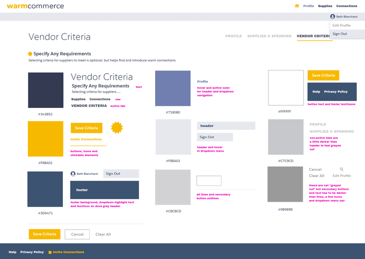
The world's briefest style guide communicated some basics about colors of buttons and elements.
This is not my best example of a style guide – the developer was picking up all the styles and specific details from Avocode for the screens. But this was something to get him started on button and link colors as well as the basic placement of navigation elements.

Making not quite enough look like more.
Unfortunately, despite being a two-sided marketplace and me needing to do a ton of screens for both the buyer and the seller, there was not that much depth to the product and nothing to do once the buyer and seller saw each's others info in the system – they would have to manually connect via email or phone. There were also issues of having enough supplier data.
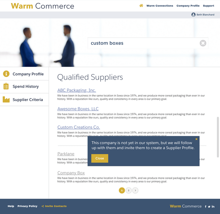
This was a true MVP to get feedback, so I did the best I could to make the design appear more substantial while also clean and clear.

inVision prototypes kept everyone in the loop, and they were used to sell vision to prospects.
As usually happens with my startup clients or employers, the inVision prototypes are used for developers, but also cleaned up with realistic data for sales and founder to use with prospects and investors.
In this case the product was not ready enough for the oil conference, and the prototypes were shown there too.

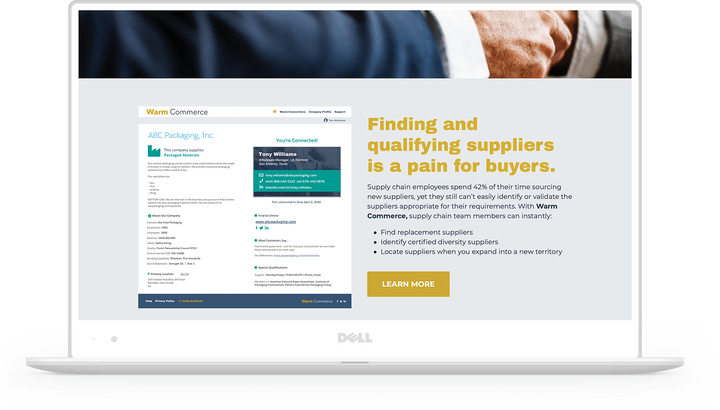
I created a simple website and marketing assets.
While the developer was finishing up the application, I moved onto the assets needed for launch of this app at a major oil-related conference in Houston. I used Strikingly to build a simple, but visually attractive site quickly that does not have the maintenance overhead and headaches WordPress does. I often recommend one of these other platforms for my small business clients for this reason.
I also created multiple datasheets, tradeshow signage, tablecloths and business cards for everyone going to the show, plus art directed an Explainer video you can see below.

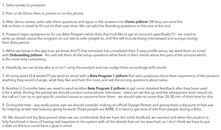
I created a Beta program to finally get user feedback.
When I can't get user feedback on the front end of a project, I do it later when the big show has passed or the deadline to launch has been met and I can get people focused on the need for real user feedback. I defined a Beta program that the salespeople could use to invite users to the new platform so we could get information to inform changes and features needed, and inserted phone interviews with a goal of hopefully finding some real users I could do usability testing with later.
Though this project did not benefit from some of my preferred UX practices, it is an example of what I can pull together quickly with a talented developer.
Explainer Video
A salesperson wrote this script and I art directed this explainer video for the site launch.


